Revisiting the Fennec Default Theme
With the release of Fennec Alpha, (Fennec is now in Beta) we showcased an initial default theme created to make mobile browsing easy on the fingers as well as the eyes. Now that a bit of time has passed, we’ve begun brainstorming what another pass at the UI might look like – seeing how we can add to an already clean and easy-to-use interface.
The initial designs were created using strong glyphs on subtle embedded touch areas as the main control scheme for the theme. The purpose of the glyphs were to act as easily identifiable symbols that could stand out on a mobile screen through the use of high contrast white on a darker background. Reaction to the first pass was that the background greys were much too light and they should be revisited to bump the readability of the glyphs. Additional feedback spoke on the lack of color within the theme, another area that was added to the list of things to investigate. As the pixel man on the job, I wanted to bring a finer level of pixel detail to the UI, so I threw that on the to-do pile as well.
Lets get started showing where we’ve made it to thus far. To be clear, the work showcased in this post is all a work-in-progress and may not reflect the UI seen in future Fennec builds.
Button Look n’ Feel
The first thing I wanted to do was take a step back and revisit how the buttons were created. Instead of beginning in Illustrator, I decided to get the right level of pixel fidelity, I’d work exclusively in Photoshop. Thanks to the glory of layer styles, the entire look and feel is now set in style sets that can be copied and applied to any UI shape needed. Quick and painless when you’re dealing with so many resolutions in the mobile world.
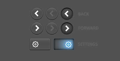
The newer style is much more clickable and thanks to the darker background, the glyphs really pop on the almost rubber-like button tops. Each glyph is softly outlined with a darker stroke to give it that extra bit of pop also.
Now, let’s look at a few more examples.
Bookmarks
With the new style comes the addition of color to some of the revised glyphs. The bookmarks buttons have been updated as shown in the example below:
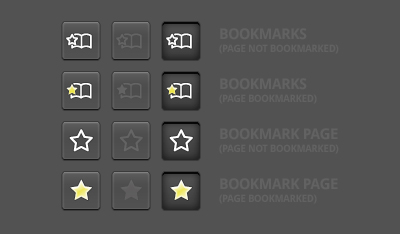
As you can see, when a page is bookmarked, the star now fills in with a frosted yellow. The small star within the bookmarks panel button also fills in if the page you are currently on has already been bookmarked. Subtle colors, adding a bit of variety but not too overpowering so that it becomes distracting.
Endcaps
Next we visit the endcaps within the location bar.
In the first pass of the Fennec UI, the endcaps were very rounded, similar to the encaps in Firefox on Mac. While the style is very nice, on mobile you need as many pixels as you can get when it comes to UI, and having extra pixels taken up by flashy unneeded graphics can limit your on-screen real estate, sometimes making things pretty much unreadable.
Realizing this, we decided to test the waters on a few different designs:
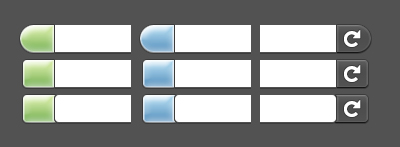
The first is basically the same as Fennec Alpha 1, except that the inner edge of the cap is now squared. The second set also uses the squared interior edge, but also squares up the outer edge a bit more as well. The third set has rounded edges for both inner and outer, but is not as extreme in its radius as the original caps.
Based on some mockup testing, we’re leaning towards the second set of endcaps, a nice mix of rounded outer edges and flush inner edges, giving us some much needed pixels in return.
Now that we have a set to focus on, lets take a look at how it could be applied.
Awesomebar
The awesomebar was the next visual overhaul we thought we’d have a crack at. With our newly minted endcaps, I started chipping away at the design to see what could be revealed. The result is a much cleaner and clearer awesomebar as seen here:
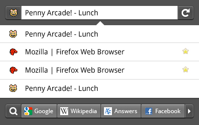
Sharp contrasts, cleaner graphics, a touch sliding search bar at the bottom, all make for a much better experience. This look n’ feel starts to show off where we’d like to go with the UI for Fennec throughout the browser – using this high contrast menu system for all the preference/setting/addon panels. Let us know what you think – we’re pretty happy with where this is going.
Past and Present
So, lets step back and take a look at where we’re coming from, and where we are at the moment:
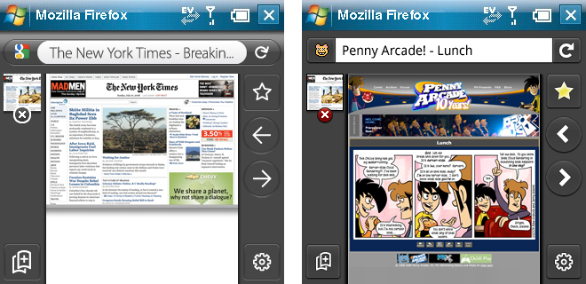
(note: the above screens do not represent an actual state of the browser in which all toolbars can be accessed at once.)
As you can see, things are starting to get a little crisper, and we’re also introducing glyphs from the bigger brother Firefox (see back and forward buttons) for further consistency. The “before” image on the left is actually a further revision to the initial UI as you can see the grey is darker than the initial screens.
As always, please give any and all feedback on these work-in-progress designs. This is an open process and nothing you see here is set in stone. If you’d like to share thoughts or concerns with us on anything previewed here, please do! It’s your browser – help us shape it and make it look great!

