

Feb142013
Illustration techniques: Sketch to vector
For those of you interested in how I created the updated version of my “Don’t hurt the Web” poster, I thought I’d share the various techniques I used in the process.
Before I get into the nuts and bolts of it, some background on the visual itself. In the poster, we see a sad little fox (Kit) in tears and looking for love and kindness. In no way is he meant to represent a run-down, tired, vulnerable Firefox. The sadness we see in Kit in the poster is his reaction to people hurting the Web he loves – it’s sadness out of the Web he loves being hurt, not himself. He isn’t meant to be addressing specific events or people, just a general reminder that no matter where we find the web – desktop or mobile – be sure to build with standards, openness, and all players in mind.
Final Artwork

Technique
Some of you may have been able to watch me stream some of the process live yesterday on my UStream channel. If you’re wondering why I introduce Illustrator into the process, it’s simply to have the artwork in vector form so if this were to be printed down the road, it will be able to be scaled to any size while still maintaining the sketch look and feel. That and I love Illustrator. <3. The following gallery shows the process in it’s entirety, so sit back and enjoy the tips included.
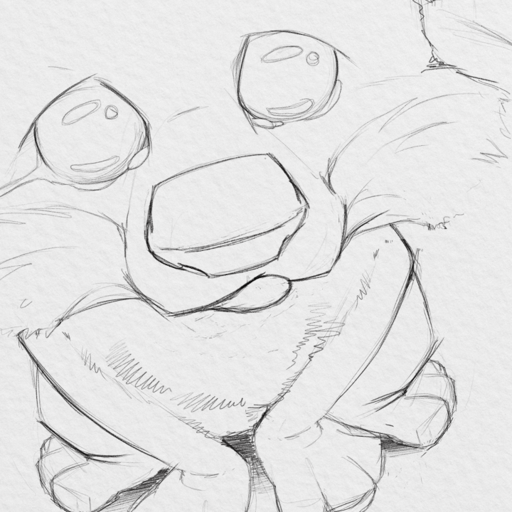
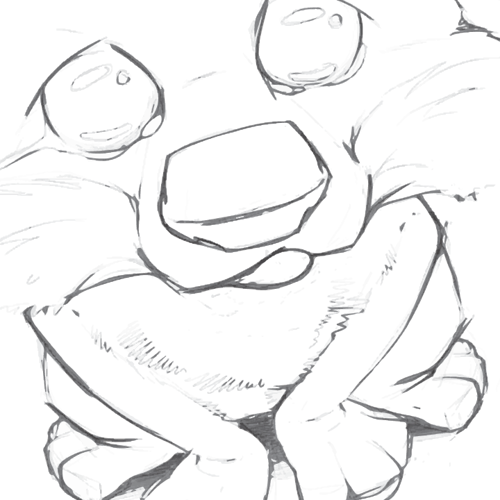
Initial freehand sketching done in Photoshop using a custom pencil
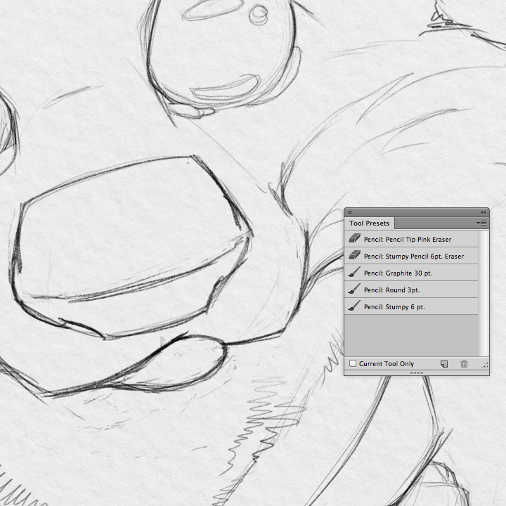
Stumpy pencil tool preset for those interested in the quality of sketch lines
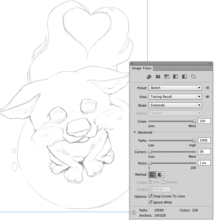
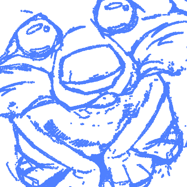
Copy and paste sketch into Illustrator, use “Image trace” panel and create a custom preset based on these settings
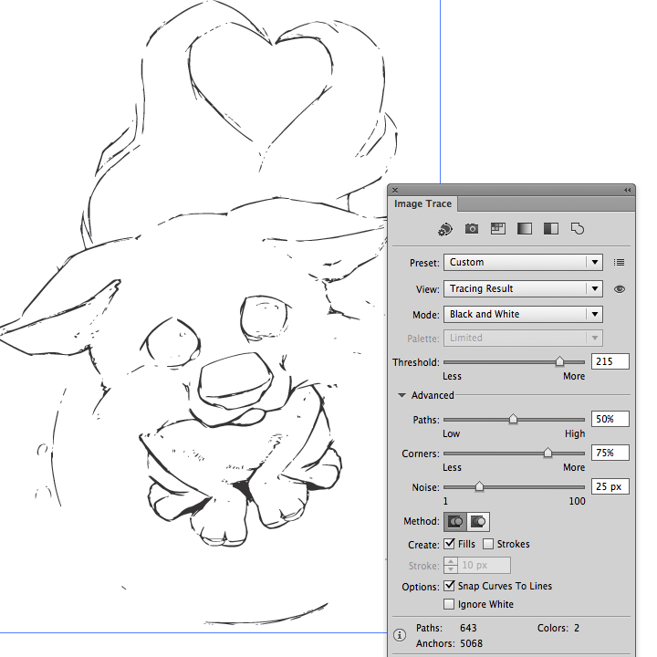
Paste the artwork again and create a custom black and white art trace for more pronounced lines

You’re left with two versions of the artwork – light fine sketch lines and thicker detail lines
Overlay both an set the transparency to multiply, the thicker lines set at 50% opacity
Vector sketch, baby!
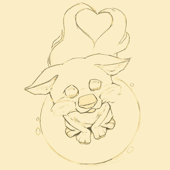
Optionally, you can create a background color to recreate the feel of off-white or colored paper
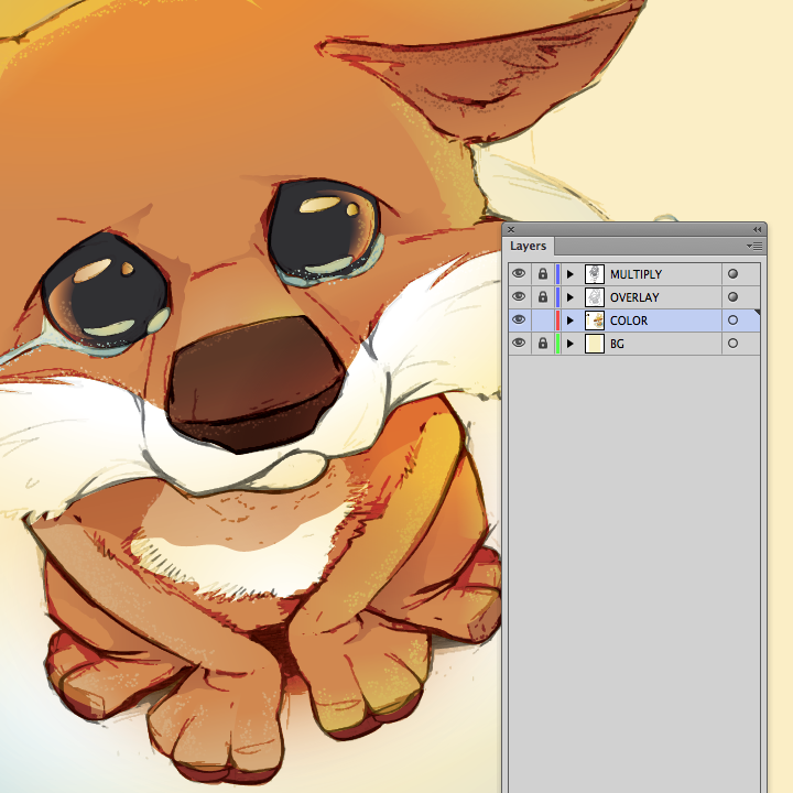
Lock your sketched layers and create a layer underneath to apply the color forms. Check my saved video of the color process
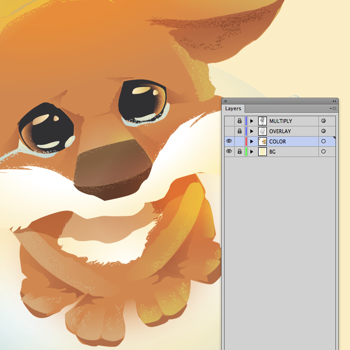
Outline layers turned off to show color layer
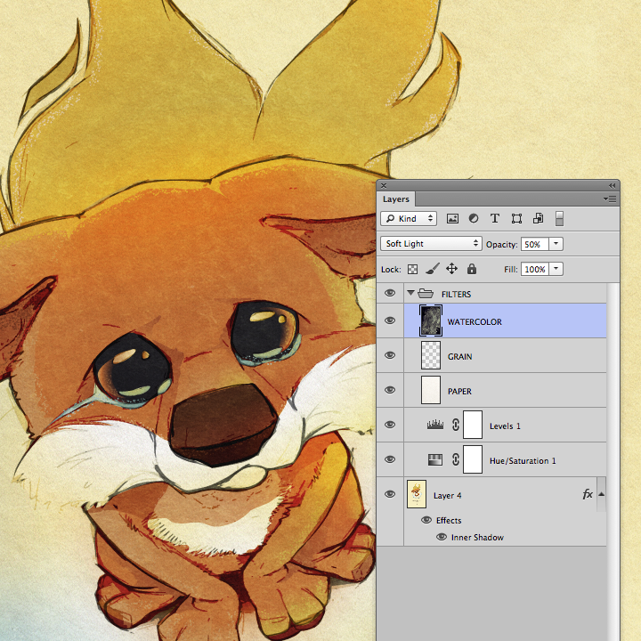
Final step is to bring it back into Photoshop and apply any textures you’d like. In this example, I apply an inverted watercolor, grain and various filters