A Tale of Two Logos: Nightly and Aurora
Aurora had but newly chased the night,
And purpled o’er the sky with blushing light.
– John Dryden, Palamon and Arcite
Folks, those book words are from an actual book. I looked them up. I have to say, they’re pretty spot on when it comes to introducing the tale I am about to tell – a tale of pixels that frolic along paths only vectors can carve.
We’ve recently had the dawn of a new day for Firefox at Mozilla with the introduction of our all new rapid release cycle. We now dispense Firefox love to the internets more often so you the user/artist/developer/general awesome person you are can take advantage of all the latest HTML glories sooner than ever before.
The introduction of the new release cycle has allowed us to create new channels for individuals to sample our wares – from nightly builds, builds that play with the first light of new features, to beta builds and beyond – there’s a flavour for everyone. We’re like Ben n’ Jerry’s now, and my stars, you’re gonna want to sample.
All Night Long
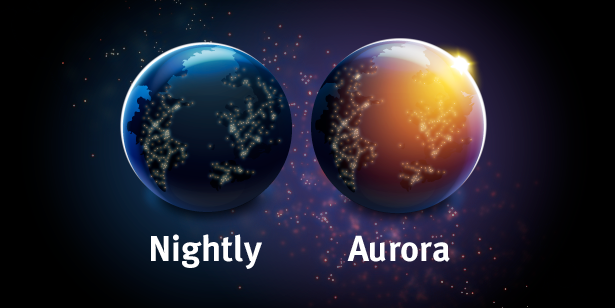
The new Nightly logo began its life fairly simply. Take one Firefox logo, give the wee fox an all-expense paid ticket to the outer edges of the artboard, and you have yourself a bare globe. Success!
After removing some of the shine and shimmer from the default globe, the shadow of night was added to blanket the continents in darkness(random land masses are random folks), keeping in mind that the sun sets in the west of course. The original mockup of the logo had the light portion on the right, but after much staring that seemed to be silly. For you see, having the light portion on the right would only work for a product named after daybreak or “dawn”. The mind pieces things together and that little gem was placed in the “save for later” pile.
So now we have our darkened globe. At this point the inhabitants were bruising their shins on coffee tables and solid forms with edges at shin height, so points of electric light were added all thanks to the inspiring glow visual dreampt up by our friends in Mozilla webdev. One quick request by our UX team for moar lights and we had ourselves a thriving populace, their power meters spinning and wallets thinning.
Good Morning
If you thought designing the logo for Nigthly was painless, wait until you hear about Aurora. Take one Nightly logo, horizontal flip the night shadow, turn off the lights in the lit region, turn on the lights in the dark region, you have yourself a predawn globe.
Purists will tell you that dawn is actually the beginning of twilight before sunrise, but that’d just be a flipped logo and a reference to a movie with emo vampires. We’re extending the reach of Aurora’s light to the instant the sun crests the edges of the globe. Yes folks, vectors have that power.
Now I have to admit, I wanted purple in this logo. My daughter, at the age of 3, insisted that I create a logo with purple in it. Lucky for me that when you overlay a radial gradient with the Firefox yellows and oranges onto the globe, you get some snazzy looking purples.
There you have it. The birth of two new logos for our rapid release channels. We hope you enjoy their presence as you partake in the rich, yummy goodness of the web using the latest in web browsery technologies.
For those keen individuals who noticed, yes “All Night Long” and “Good Morning” are Lionel Ritchie song titles. Congratulations!


