CSS3 & Flexible UI: Avoid Recutting UI Graphics for Mobile
Working on the Fennec UI has been an amazing experience.
Designing UI elements for a mobile browser has taught me a great deal when it comes to creating interactive graphical elements that are to be used in a very small space. Of course, when I say small space, I mean a small space that has the potential to be different for each handset out there. Not only are we talking resolution differences, but the screen DPI can change from device to device as well.
So after resizing and re-slicing the Fennec UI for the second time, I quickly realized that this could be a full-time job for a team of designers depending on the list of handsets Fennec will be appearing on.
Hold the phone… whats this? Firefox 3.5 enables a new slew of fun CSS3 design styles eh? Rounded edges eh? Embedded fonts eh?
* gears turning, monkeys typing, hamsters running *
What if we could replace almost all of the graphical UI elements within Fennec with CSS created equivalents? As a designer, am I comfortable bypassing Photoshop and letting CSS run the pixel rodeo? After a few initial tests, the answer to both of those questions was a very solid “yes”. A solid “friggin’ right” if in Cape Breton.
DISCLAIMER: These design tests are done to see how close we can get CSS to replicate rasterized images. The elements you will see here may or may not appear in any Fennec builds.
Toggles and Options
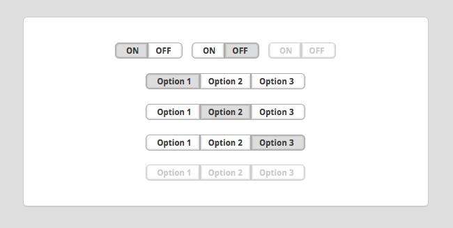
The first challenge was creating “on/off” toggles for the preferences pane within Fennec. Doing some quick research into what could be done with CSS3 in Firefox 3.5, the ultimate arsenal was discovered: the -moz-border-radius, -moz-border-color, @font-face, and opacity styles.

As you can see, the resulting UI is super crisp. There are zero graphics involved in any of these toggles. Here is an example of the code for the first “on/off” set:
.toggleONleft {
font-family: ‘DroidSans-Bold’;
text-transform:uppercase;
padding: 0px 8px 0px 12px;
-moz-border-radius-topleft: 0.5em;
-moz-border-radius-bottomleft: 0.5em;
-webkit-border-top-left-radius: 0.5em;
-webkit-border-bottom-left-radius: 0.5em;
border-top: 4px solid #aaa;
border-left: 4px solid #ccc;
border-right: 4px solid #ccc;
border-bottom: 4px solid #ccc;
-moz-border-top-colors:#aaa #bbb #ccc #ddd;
-moz-border-left-colors:#aaa #bbb #ccc #ddd;
-moz-border-bottom-colors:#aaa #bbb #ccc #ddd;
-moz-border-right-colors:#aaa #bbb #ccc #ddd;
background-color: #ddd;
display: inline;
}
.toggleOFFright {
font-family: ‘DroidSans-Bold’;
text-transform:uppercase;
color:#414141;
padding: 0px 12px 0px 8px;
-moz-border-radius-topright: 0.5em;
-moz-border-radius-bottomright: 0.5em;
-webkit-border-top-right-radius: 0.5em;
-webkit-border-bottom-right-radius: 0.5em;
border-top: 4px solid #ccc;
border-left: 4px solid #ccc;
border-right: 4px solid #ccc;
border-bottom: 4px solid #aaa;
-moz-border-top-colors:#aaa #fff #fff #fff;
-moz-border-right-colors:#aaa #dedede #efefef #fafafa;
-moz-border-left-colors:#aaa #dedede #efefef #fafafa;
-moz-border-bottom-colors:#aaa #dedede #efefef #fafafa;
background-color: #fff;
display: inline;
}
Dark Toggles

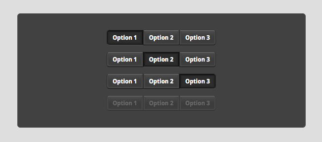
Dark toggles were very simple to create now that the above CSS was already written. It was just a matter of setting the fill colors, border radius, and gradient border colors. Resizing these for different resolutions takes minutes of hex color and margin/padding tweaks! That’s it.
Buttons

Next was the challenge of seeing how close we could get to matching the mockups I created a while back. Turns out, pretty close indeed. Having to use an image for only the glyph in the middle makes button creation much, much easier.
.button {
padding: 8px 4px;
font-family: ‘DroidSans-Bold’;
color:#fff;
width: 24px;
-moz-border-radius: 0.5em;
-webkit-border-radius: 0.5em;
border-top: 4px solid #ccc;
border-left: 4px solid #ccc;
border-right: 4px solid #ccc;
border-bottom: 4px solid #aaa;
-moz-border-top-colors:#3b3b3b #6d6d6d #535353 #494949;
-moz-border-right-colors:#2d2d2d #484848 #484848 #414141;
-moz-border-left-colors:#2d2d2d #484848 #484848 #414141;
-moz-border-bottom-colors:#111111 #484848 #484848 #414141;
background: #414141 url(‘buttonBg.png’) repeat-x top center;
display: inline;
}
.buttonDisabled {
padding: 8px 4px;
font-family: ‘DroidSans-Bold’;
color:#999;
width: 24px;
-moz-border-radius: 0.5em;
-webkit-border-radius: 0.5em;
border-top: 4px solid #ccc;
border-left: 4px solid #ccc;
border-right: 4px solid #ccc;
border-bottom: 4px solid #aaa;
-moz-border-top-colors:#3b3b3b #6d6d6d #535353 #494949;
-moz-border-right-colors:#3b3b3b #484848 #484848 #414141;
-moz-border-left-colors:#3b3b3b #484848 #484848 #414141;
-moz-border-bottom-colors:#2d2d2d #484848 #484848 #414141;
background: #414141 url(‘buttonBg.png’) repeat-x top center;
display: inline;
}
.buttonPressed {
padding: 4px 0px;
font-family: ‘DroidSans-Bold’;
color:#fff;
width: 24px;
-moz-border-radius: 0.5em;
-webkit-border-radius: 0.5em;
border-top: 8px solid #ccc;
border-left: 8px solid #ccc;
border-right: 8px solid #ccc;
border-bottom: 9px solid #aaa;
-moz-border-top-colors:#323232 #111111 #111111 #1f1f1f #272727 #2a2a2a #2c2c2c #2d2d2d;
-moz-border-right-colors:#323232 #111111 #1f1f1f #272727 #292929 #2a2a2a #2c2c2c #2d2d2d;
-moz-border-left-colors:#323232 #111111 #1f1f1f #272727 #292929 #2a2a2a #2c2c2c #2d2d2d;
-moz-border-bottom-colors:#515151 #111111 #1f1f1f #272727 #292929 #2a2a2a #2c2c2c #2d2d2d;
background-color: #2d2d2d;
display: inline;
}
Address Bar
The focus moving forward will be the address bar. Copy and pasting code used in the above elements, playing around with padding and border radius, a fairly close representation can be made. An example of the first pass:

Now that I’ve shown you all of these examples (I’ve used images here so everyone can see the results), go check out everything on the demo pages. For some added fun, zoom in and out within Firefox to see the UI scale!
DISCLAIMER (again): None of the elements on the demo page are interactive as this is just a CSS test for visual design only.
These are all design challenges that Firefox 3.5 has enabled me to solve. I’m very excited to see what designers can create using all the new CSS3 styles and feel free to examine the screen.css file on the demo page to nab the code previewed here.
Go design happy and give it a whirl, but remember, you need the latest Firefox to join in on the fun!

