Illustrating a Hologram in Vector
During a Mozilla Labs week a while back, I was tasked with creating a logo for a yet to be realized project that centered around a person’s contacts. That initial experiment has matured into a full Labs project and is now up and running as Mozilla Labs Contacts, so head on over and check it out.
When it comes to the actual logo, whatever possessed me to try and illustrate a field of undulating light in vector is beyond me. I may have been mad at myself for not grabbing a cup of coffee that morning, or perhaps I was keen on having a headache that day. Either way, it happened – so I thought I’d share the process.
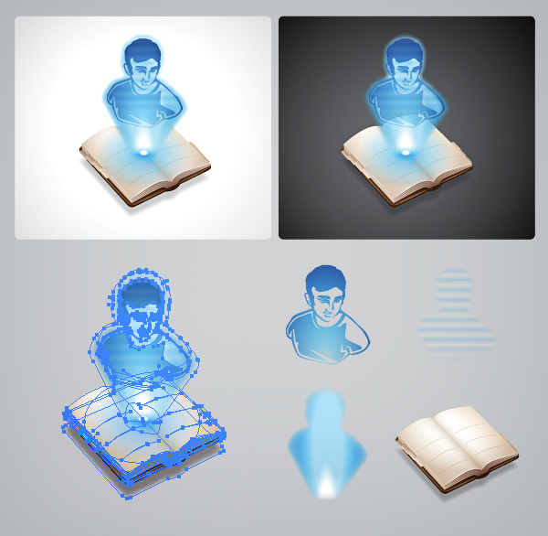
First order of business, I illustrated the address book. A fairly straight forward illustration – gradients and strips of color forming the volume of the pages and cover. As always, applying more than one gradient to a shape using the Appearance panel within Illustrator is key to getting volume, ambient light and shadows looking the way you want. Layering colors and gradients using different transparency effects is the greatest technique for building anything in vector.
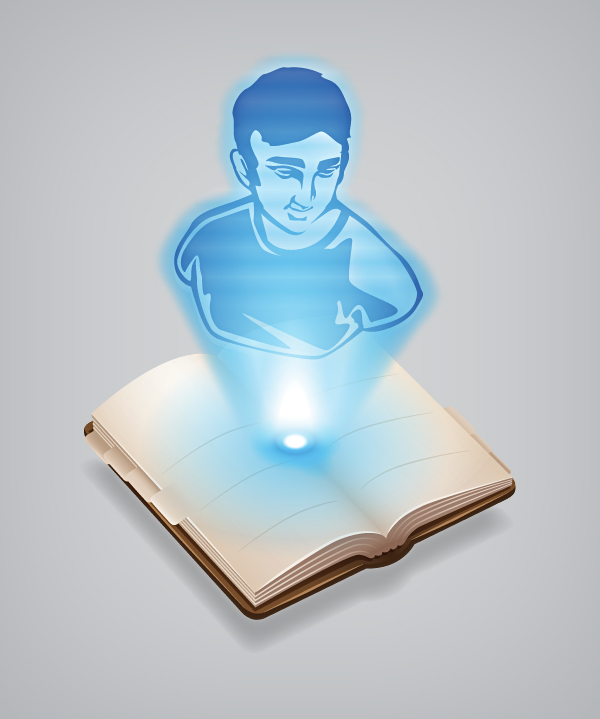
Now comes the fun part – projected holographic light! Of course, the line “Help me Obi Wan..” popped into my head as soon as I started and stuck as the main inspiration for the visual. The first step was to create a human shape on a similar 3/4 plane as the book. I hunted around for an inspirational image and found a nice classic bust sculpture at the proper angle. The next task was illustrating it with high contrast light and shadow outlines to allow a”pass through” look for the 3D light form. A bottom up radial gradient gave the illusion of a light source originating from the book which I then augmented with another full outline of the shape including the beam itself. Adding a “Stylize > Feather” effect to the vector shape gave it a nice transparent gaseous look and completed the form. Of course, the whole technology of projected holograms is not yet perfected, so I had to create an overlay gradient of wavy lines to convey signal frequency issues. All the needed elements were now complete. Put them together and what have you got? Bippity boppity boo in most cases, but in this case a somewhat believable hologram.
At some point I may create a video showing the techniques used in the creation of one of my logos. I’ll be sure to see what I can whip up in the form of an instructional video when I can find the time. *presses the laugh track button* Seriously, though, I’ll see what I can come up with.


