Space, Vectors, and wee Mozillians
My life at Mozilla can be summed up in one statement – another day, another insanely fun design request. The latest example I have for your viewing pleasure is the result of a request for branding the new Add-ons Developer Hub – coming soon to an internet near you. It isn’t every day you get a design request that involves words like “hub” and “portal” so my mind instantly went on overdrive and within seconds spit out “space station” as a creative answer. The following debrief is where I went from there.
Initial Inspiration
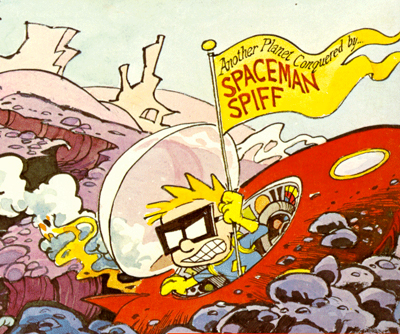 To me, and quite likely to most of you out there, a subject such as a space station can drum up lots of imagery. We’re bombarded with Sci-Fi constantly and we get to see lots of space vessels and stations in all the glowy, shiny bits of Star Trek, Star Wars and Battlestar Galactica moving picture shows. Now those are all excellent sources for inspiration, but my mind decided to travel into the deep recesses of my brain to two excellent sources from my childhood – Calvin and Hobbes’ Spaceman Spiff and Space Quest 3: The Pirates of Pestulon.
With Spaceman Spiff, we have an example of space vehicle design at its simplest, and in my mind, the perfect look for a ship in the logo. It’s a classic UFO saucer style, full glass dome and all. I have the entire Calvin and Hobbes collection in hardcover and I couldn’t let this opportunity to draw inspiration from my favorite childhood comic pass me by. DEATH TO NAGOONS! Done.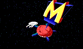
Now when thinking about the design of the space station itself, my mind went straight to Monolith Burger from Space Quest 3. I spent many an hour trying to land Astro Chicken on the pads in the arcade mini-game found within its pressurized walls. The interstellar diner is apparently now firmly etched within my brain. This game still holds steady as one of my top five games of all time. The Two Guys from Andromeda were geniuses and it was a sad day when Ken and Roberta Williams handed over the reigns of Sierra. But I digress. Achievement unlocked: Space station inspiration. On to the sketches.
A Few Quick Sketches
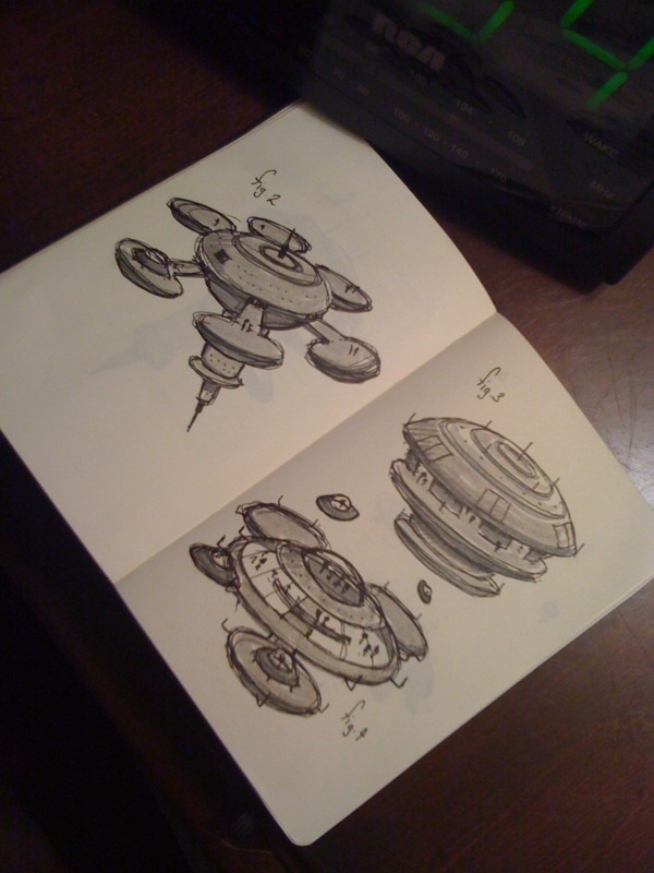
Having gathered my sketching markers and moleskin, I began sketching out some station designs. As much fun as it is to use a Wacom Cintiq, nothing beats sketching in a moleskin with a graphic pen. There is no undo and if you make a mistake, most times you can turn that mistake into a new feature you hadn’t planned. Happy accidents.
Final Logo Design
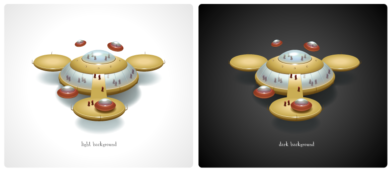
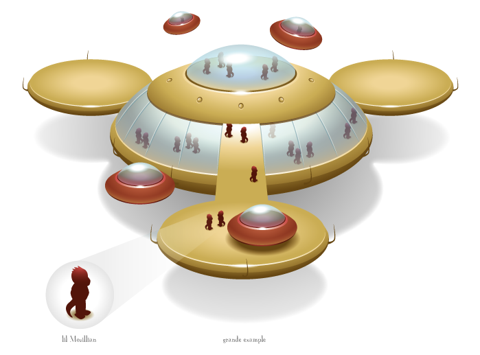
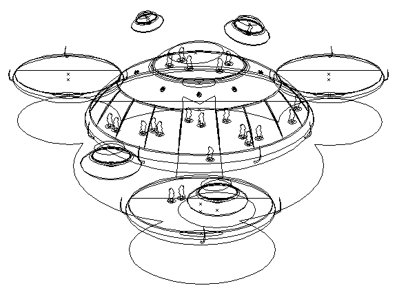
In the end, I’m happy with how the logo turned out. It took 5 hours total once I started illustrating it with vector. I kept the palette the same as the Add-ons logo and went with more of a brass look to the station instead of a standard greenish-grey “space metal” look. If you look closely, the inhabitants of the station are wee Mozillians that are either planning for Browser Wars or forming a song list for the inevitable Karaoke marathon that occurs in every space station. Be prepared for their next move.
