Firefox New Tab: Now With More Pixels!
As mentioned in the Mozilla Labs post Firefox New Tab: Visual Update, we have been playing around with a new look n’ feel for the New Tab feature.
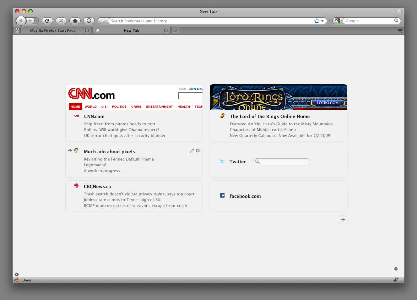
The main inspiration for this visual look comes from the netError styling already found within Firefox. Using the rounded edge boxes on the light grey background, we utilize an already established look within the browser, thus bringing the About:Tab feature that much closer to a “native” feel. The look is very lightweight and may be tweaked further, but its intent is to not overwhelm – it serves its function cleanly with Firefox native graphics. A consistent palette will be set for all elements and we will ensure that browser integration is solid.
Aza mentions that “By using a horizontal thumbnail clipped from the top of a page, we are capturing the site’s logo and masthead” the most visually distinctive aspect of a web page. By default only the top two visited sites get a visual treatment (to remove visual clutter), but more can be turned on by clicking the little edit icon. We’ve gone to a two-column format to better use the available space. If you have an extra wide monitor, you may get more columns.”
The visited site modules also use the rounded box look and can be dragged and edited using the UI elements within. In the mockup, the height of these modules remains constant to create a clean grid structure to the tab – the content being justified vertically within. We’ll play around a bit more to see if there are other options on how to structure these modules.
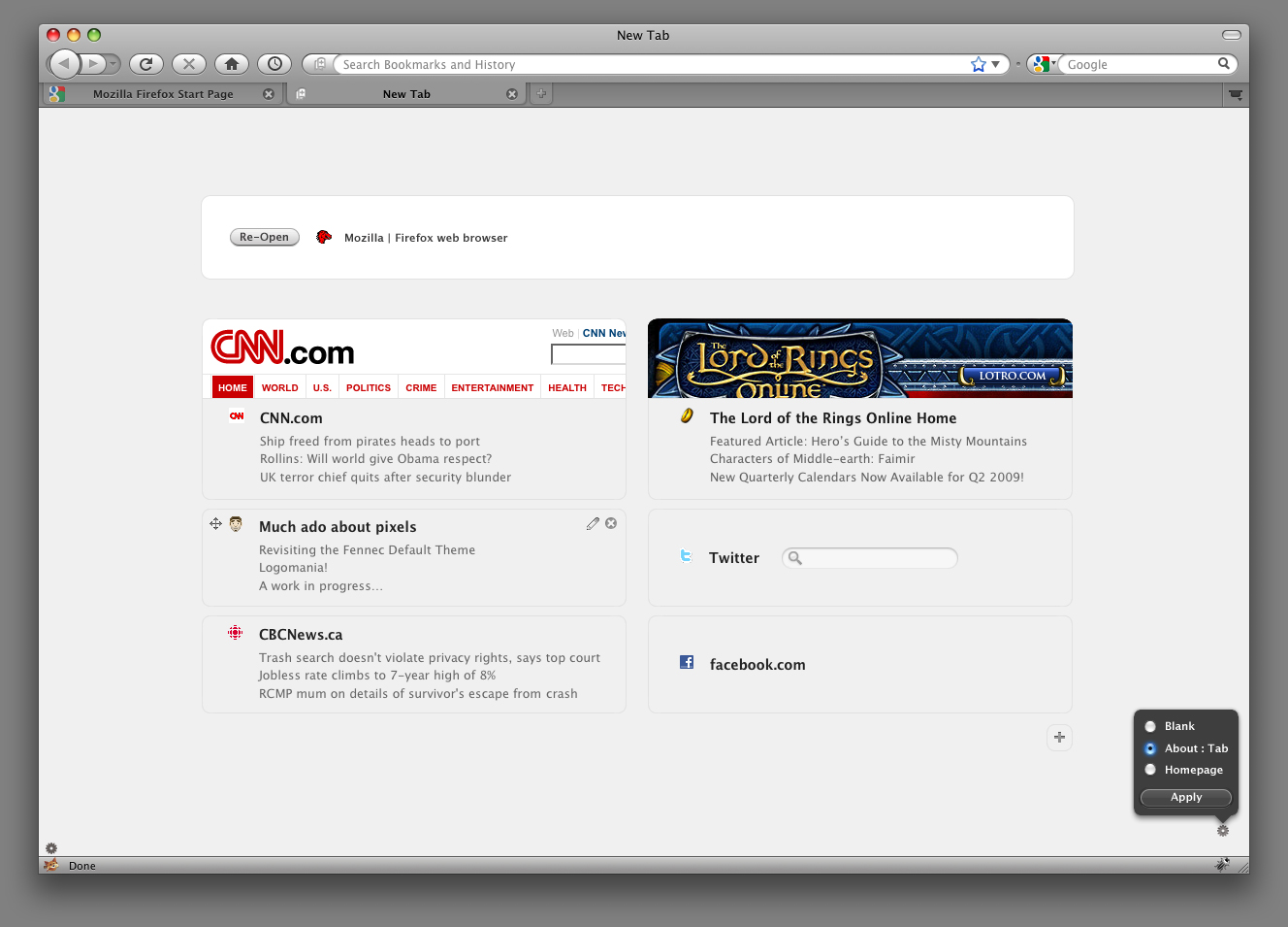
Also in the mockup (see fig. 2), when a clipboard action comes into play, the columns will bump down and the action will appear in a white box for your interaction. Depending on the number of actions available and screen size, this may dictate the number of visited sites seen within the columns.
Finally, in the bottom right corner of the tab, we see the prefs icon which allows you to set your default newly created tabs to be either blank, the about:tab feature, or your homepage. The look and feel for this overlay was also taken from current stylings within Firefox.
As always, these designs are shared for your feedback. Please leave any constructive comments you may have on any of the elements within these mockups.
Let us know what you think!


